Tablist widgets (or: tab panels, tabs)
Tablists help to split up a page's content into smaller and thus more digestible parts. Each part is minimally represented in a list of names, by which their visibility can be enabled one at a time. Tablists can be thought of as small page fragments inside a page.
Tablists are well known as native controls in many operating systems: a list of controls (usually on top of the element) allows to toggle the visibility of corresponding panels. Only a single control can be active at a time, so exactly one panel is visible and all others are hidden.

We do not call tablists simply "tabs" so the difference to the Tab key is obvious.
General requirements
The following requirements are based on well established best practices and WAI-ARIA Authoring Practices: Tab Panel Widget.
Besides many other requirements, we want to stress out explicitly the following:
- The meaning and usage of the tablist must be clear.
- The state of each tab control must be perceivable ("active/inactive" or similar).
- Proper feedback must be given upon activating a tab control ("active" or similar).
- The tablist must be operable using both keyboard only and screen readers (with a reasonable interplay of default keys like
Tab,Enter/Space,Esc,Arrowkeys), as well as mobile screen readers. - The panel contents must be easily accessible using both keyboard only and screen reader.
Similarities with accordions and carousels
Maybe you never noticed that tablists, carousels, and accordions - although looking pretty distinct from each other - all solve a very similar use case: toggling the visibility of contents.
Tablists are the most basic pattern of them all. Carousels then extend it by providing additional controls like previous/next and autoplay/pause button(s). And accordions extend it by stacking all controls and panels on top of each other; in addition, some of them allow to display multiple panels at the same time.
Because of this, the following texts apply not only to tablists, but also to carousels (see Carousels (or: slideshow, slider)) and accordions (see Accordions).
Proofs of concept
Before you go on, please read What is a "Proof of concept"? (POC).
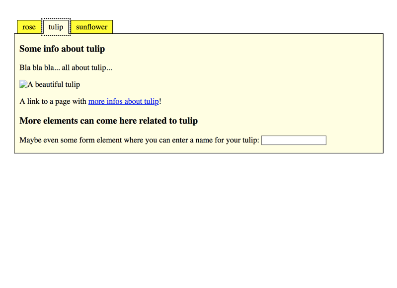
ARIA is supported pretty well for tablists (see POC #1). If you need a much simpler solution though, and according to our credo Widgets simply working for all, the easiest way to create a tablist is using a simple group of radio buttons (see POC #2).
POC #1: ARIA
TODO
Implementation details
TODO
POC #2: Radio buttons
They can be styled visually as needed using CSS, and spiced up with (very little) JavaScript, so they behave like perfect tablists.
Sensible naming of elements (and a few specifically added visually hidden texts) guarantees that screen reader users know how to handle the element - even if they have not seen any other tablist before.
Implementation details
Some interesting peculiarities:
- Elements are announced properly by screen readers, and it is clearly perceivable which control is active: the one with the active radio button.
- Proper feedback is given upon interaction: whenever a control is activated, the screen reader announces the respective radio button's state.
- Collapsed panels are hidden effectively from everybody, see Hiding elements from all devices.
- Where functionality may not be obvious to screen reader users, descriptive text is given (only visible to screen readers):
- The tablist/carousel/accordion's main heading has "tablist/carousel/accordion" appended.
- A small help text explains how the tablist/carousel/accordion works.
- The controls are named "tablist/carousel/accordion controls" and are placed within a
fieldset/legendstructure (see Grouping form controls with fieldset and legend). - Each control is named "Show panel X".
- Each panel's heading has "panel" appended.
- The tablist/carousel/accordion controls are placed in the DOM before the panels:
- As the whole element is properly marked up with headings, screen reader users can jump very quickly between controls and panels (see How to handle headings).
- Using
.tablist:focus-within .control label, a style can be applied to all radio button labels upon interacting with the tablist.- This gives users a clue that they are interacting with a single control now (indicating to use the
Arrowkeys instead ofTabto navigate through tab items). - If you would rather like to make each control focusable on its own, you could use a group of checkboxes instead of radio buttons. - Do not forget to make sure only one of them is checked at a time though (using some JavaScript).
- This gives users a clue that they are interacting with a single control now (indicating to use the