The introduction of smartphones increasingly led web designers to avoid traditional "bulky" HTML tables - because these would exceed the limited screen dimensions. Others tried to find ways to change the layout of tables so they would not need so much horizontal space anymore. Responsive tables were born. But to make them accessible, the use of some ARIA is essential.
Tables - a relic of days gone by?
Tables exist since the very early days of the internet. In and by themselves, their layout is meant to have a lot of horizontal space available.
Since portable devices like smartphones have become increasingly popular, screens have tended to become smaller and smaller. Alas, the use of traditional tables tends to be avoided by many modern websites (to prevent the need of horizontal scrolling).
On the other side, there have also been attempts to change the layout of traditional tables so they would fit these new requirements. Sadly, most of these attempts left accessibility behind. So we show you to change a table's visual appearance while keeping accessibility intact.
Allow scrolling
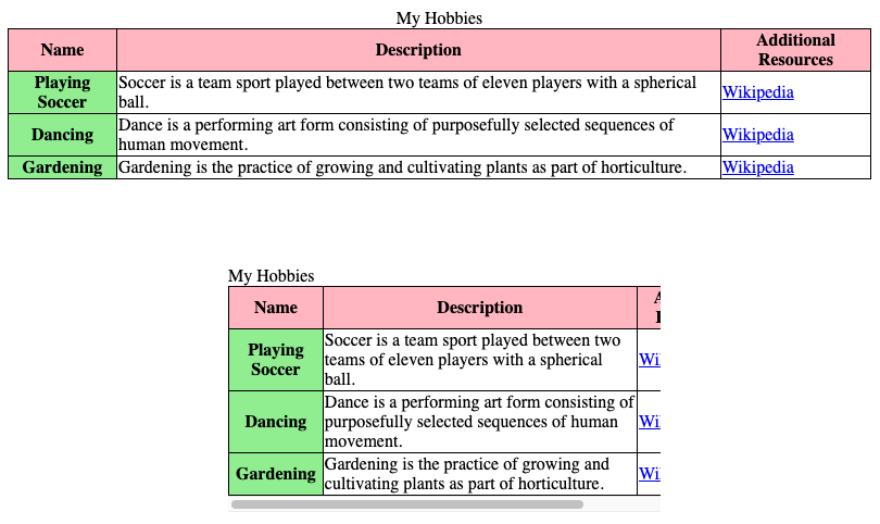
The safest baseline approach to make a responsive table is to not change its layout and add a scroll container.
<divrole="region"aria-labelledby="Caption01"tabindex="0"class="table-container"><table><captionid="Caption01">
My Hobbies
</caption><thead><tr><th>Name</th><th>Description</th><th>Additional Resources</th></tr></thead><tbody><tr><th>Playing Soccer</th><td>
Soccer is a team sport played between two teams of eleven players with
a spherical ball.
</td><td><ahref="https://en.wikipedia.org/wiki/Association_football"
>Wikipedia</a
>
</td></tr><tr><th>Dancing</th><td>
Dance is a performing art form consisting of purposefully selected
sequences of human movement.
</td><td><ahref="https://en.wikipedia.org/wiki/Dance">Wikipedia</a></td></tr><tr><th>Gardening</th><td>
Gardening is the practice of growing and cultivating plants as part of
horticulture.
</td><td><ahref="https://en.wikipedia.org/wiki/Gardening">Wikipedia</a></td></tr></tbody></table></div>
table {
border-collapse: collapse;
min-width: 30rem; /* Arbitrary value to force scrollbars on small screens */
}
@media (max-width: 31rem) {
caption {
text-align: left;
}
}
theadth {
background-color: lightpink;
}
tbodyth {
background-color: lightgreen;
}
th,
td {
border: 1px solid;
}
/* See https://adrianroselli.com/2020/11/under-engineered-responsive-tables.html#CSS */.table-container[role='region'][aria-labelledby][tabindex] {
overflow: auto;
}
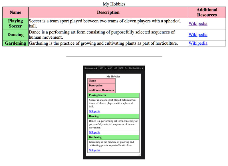
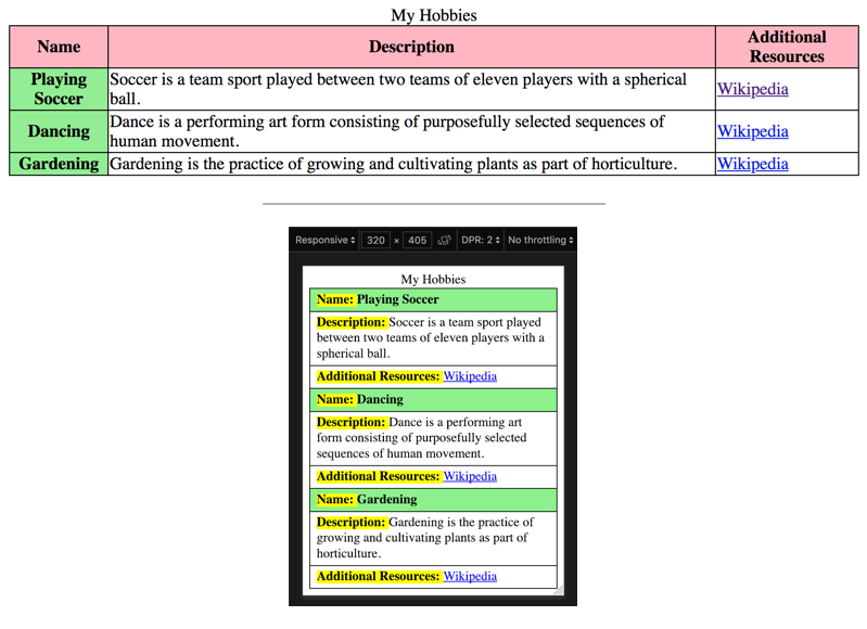
But sometimes, the visual layout of a table needs to be changed completely to fit small screens.
As we already know: to alter a table's visual appearance, the display property can be changed, and some ARIA needs to be added (if you haven't done this yet, go back and read Changing a table's visual layout). Take a look at the following example of a responsive table: when resizing the browser, you will see all elements stack on top of each other.
<tablerole="table"><caption>
My Hobbies
</caption><theadrole="rowgroup"><trrole="row"><throle="columnheader">Name</th><throle="columnheader">Description</th><throle="columnheader">Additional Resources</th></tr></thead><tbodyrole="rowgroup"><trrole="row"><throle="rowheader">Playing Soccer</th><tdrole="cell">
Soccer is a team sport played between two teams of eleven players with a
spherical ball.
</td><tdrole="cell"><ahref="https://en.wikipedia.org/wiki/Association_football"
>Wikipedia</a
>
</td></tr><trrole="row"><throle="rowheader">Dancing</th><tdrole="cell">
Dance is a performing art form consisting of purposefully selected
sequences of human movement.
</td><tdrole="cell"><ahref="https://en.wikipedia.org/wiki/Dance">Wikipedia</a></td></tr><trrole="row"><throle="rowheader">Gardening</th><tdrole="cell">
Gardening is the practice of growing and cultivating plants as part of
horticulture.
</td><tdrole="cell"><ahref="https://en.wikipedia.org/wiki/Gardening">Wikipedia</a></td></tr></tbody></table>
As the table is enhanced using ARIA, this generally works for screen reader users.
Optimisation for visual users
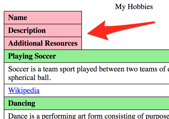
Visually though, our table is not fully appealing yet, because in narrow view, the table headers' position on top of the table feels wrong.
Hiding table headers visually
In a first attempt, we can hide them visually in narrow view (if you haven't done this yet, go back and read Hiding elements visually by moving them off-screen). This way, they keep working for screen readers.
<tablerole="table"><caption>
My Hobbies
</caption><theadrole="rowgroup"><trrole="row"><throle="columnheader">Name</th><throle="columnheader">Description</th><throle="columnheader">Additional Resources</th></tr></thead><tbodyrole="rowgroup"><trrole="row"><throle="rowheader">Playing Soccer</th><tdrole="cell">
Soccer is a team sport played between two teams of eleven players with a
spherical ball.
</td><tdrole="cell"><ahref="https://en.wikipedia.org/wiki/Association_football"
>Wikipedia</a
>
</td></tr><trrole="row"><throle="rowheader">Dancing</th><tdrole="cell">
Dance is a performing art form consisting of purposefully selected
sequences of human movement.
</td><tdrole="cell"><ahref="https://en.wikipedia.org/wiki/Dance">Wikipedia</a></td></tr><trrole="row"><throle="rowheader">Gardening</th><tdrole="cell">
Gardening is the practice of growing and cultivating plants as part of
horticulture.
</td><tdrole="cell"><ahref="https://en.wikipedia.org/wiki/Gardening">Wikipedia</a></td></tr></tbody></table>
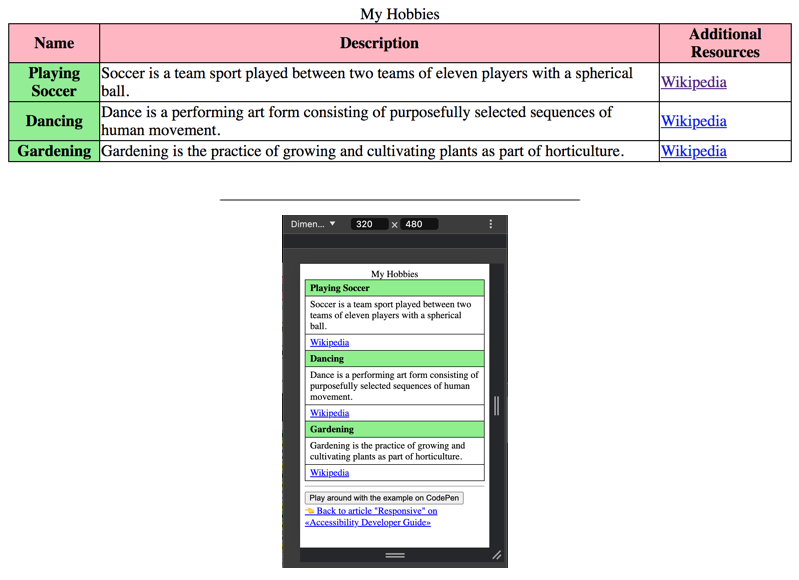
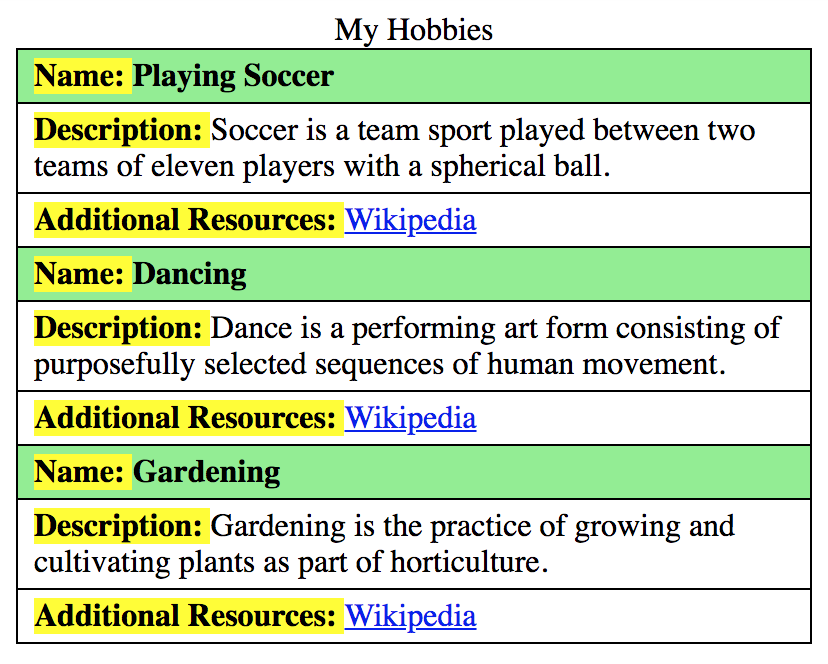
It would be even more beautiful if the table headers could be displayed visually next to each table cell. For this, we have to add them in each cell, but display them only in narrow view.
But this is redundant information for screen readers, so we use aria-hidden="true", trying to hide those additional table headers again.
<tablerole="table"><caption>
My Hobbies
</caption><theadrole="rowgroup"><trrole="row"><throle="columnheader">Name</th><throle="columnheader">Description</th><throle="columnheader">Additional Resources</th></tr></thead><tbodyrole="rowgroup"><trrole="row"><throle="rowheader"><spanaria-hidden="true"class="narrow-th">Name: </span>Playing Soccer
</th><tdrole="cell"><spanaria-hidden="true"class="narrow-th">Description: </span>Soccer is
a team sport played between two teams of eleven players with a spherical
ball.
</td><tdrole="cell"><spanaria-hidden="true"class="narrow-th">Additional Resources: </span
><ahref="https://en.wikipedia.org/wiki/Association_football"
>Wikipedia</a
>
</td></tr><trrole="row"><throle="rowheader"><spanaria-hidden="true"class="narrow-th">Name: </span>Dancing
</th><tdrole="cell"><spanaria-hidden="true"class="narrow-th">Description: </span>Dance is
a performing art form consisting of purposefully selected sequences of
human movement.
</td><tdrole="cell"><spanaria-hidden="true"class="narrow-th">Additional Resources: </span
><ahref="https://en.wikipedia.org/wiki/Dance">Wikipedia</a></td></tr><trrole="row"><throle="rowheader"><spanaria-hidden="true"class="narrow-th">Name: </span>Gardening
</th><tdrole="cell"><spanaria-hidden="true"class="narrow-th">Description: </span>Gardening
is the practice of growing and cultivating plants as part of
horticulture.
</td><tdrole="cell"><spanaria-hidden="true"class="narrow-th">Additional Resources: </span
><ahref="https://en.wikipedia.org/wiki/Gardening">Wikipedia</a></td></tr></tbody></table>
There we are: here you have an accessible responsive table.
Admittedly, this has become a bit complex now. If you are using any kind of template engine, the additional markup can be generated automatically at least.
This solution will generally deliver a good experience to all kinds of users. But please keep in mind that the safest approach is still the one with a scroll container (see first example).