Very similar to tablists, carousels also help to split up a page's content into smaller and thus more digestible parts which can be toggled visible one at a time.
Carousels are well known especially from photo galleries. They offer a list of controls (usually on top of the element) which allow to toggle the visibility of corresponding panels. Only a single control can be active at a time, so exactly one panel is visible and all others are hidden.
We do not call carousels "sliders" so the difference to the slider pattern (selecting a value in a min/max range) is obvious.
Before you continue, please read Tablist widgets (or: tab panels, tabs) to understand why carousels are extended variants of tablists, simply providing additional controls like previous/next buttons, and sometimes autoplay functionality.
General requirements
The following requirements are based on well established best practices; unlike most other common widget patterns, the WAI-ARIA Authoring Practices do not offer a section about carousels.
In addition to the tablists' requirements, and besides many other requirements, we want to stress out explicitly the following:
Previous/next buttons allow to toggle through available slides (optional).
Autoplay functionality toggles through available slides automatically (optional).
Autoplay functionality must be pauseable.
Proof of concept
Based on the tablists' proof of concept, with additional controls:
<p><button>Focusable element before</button></p><divclass="carousel"data-adg-carousel="my-carousel"><h1class="visually-hidden">
Flowers (carousel)
</h1><pclass="visually-hidden">
Carousel help: use the carousel controls to toggle the visibility of their respective panels (below the controls).
</p><fieldsetclass="controls"><legendclass="visually-hidden">Carousel controls</legend><divclass="control"><buttonaria-pressed="true"data-carousel-autoplay=""data-carousel-id="carousel_flowers">Autoplay</button></div><divclass="control"><buttondata-carousel-direction="previous"data-carousel-id="carousel_flowers">Previous</button></div><divclass="control"><inputchecked=""class="visually-hidden"id="carousel_flowers_rose"name="carousel_flowers"type="radio"value="carousel_flowers_rose" /><labelfor="carousel_flowers_rose"><spanclass="visually-hidden">Show panel rose</span></label></div><divclass="control"><inputclass="visually-hidden"id="carousel_flowers_tulip"name="carousel_flowers"type="radio"value="carousel_flowers_tulip" /><labelfor="carousel_flowers_tulip"><spanclass="visually-hidden">Show panel tulip</span></label></div><divclass="control"><inputclass="visually-hidden"id="carousel_flowers_sunflower"name="carousel_flowers"type="radio"value="carousel_flowers_sunflower" /><labelfor="carousel_flowers_sunflower"><spanclass="visually-hidden">Show panel sunflower</span></label></div><divclass="control"><buttondata-carousel-direction="next"data-carousel-id="carousel_flowers">Next</button></div></fieldset><divclass="panel"id="carousel_flowers_rose_panel"style="display: block"><h2>
Rose<spanclass="visually-hidden"> (panel)</span></h2><p>
A rose is a woody perennial flowering plant of the genus Rosa, in the family Rosaceae, or the flower it bears. There are over three hundred species and tens of thousands of cultivars.
</p><imgsrc="https://upload.wikimedia.org/wikipedia/commons/thumb/e/e6/Rosa_rubiginosa_1.jpg/259px-Rosa_rubiginosa_1.jpg"alt="Rosa rubiginosa by Stan Shebs (wikimedia.org)"height="160"><h3>
Botany
</h3><p>
The flowers of most species have five petals, with the exception of Rosa sericea, which usually has only four. Each petal is divided into two distinct lobes and is usually white or pink, though in a few species yellow or red. Beneath the petals are five sepals (or in the case of some Rosa sericea, four).
</p><p>
Learn more: <ahref="https://en.wikipedia.org/wiki/Rose"target="_blank">Rose (wikipedia.org)</a></p><p><labelfor="first_input"><strong>Name your favorite rose:</strong></label><inputid="first_input"type="text" /></p></div><divclass="panel"id="carousel_flowers_tulip_panel"style="display: none"><h2>
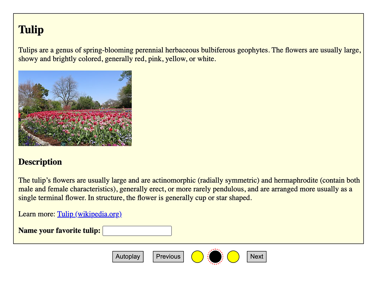
Tulip<spanclass="visually-hidden"> (panel)</span></h2><p>
Tulips are a genus of spring-blooming perennial herbaceous bulbiferous geophytes. The flowers are usually large, showy and brightly colored, generally red, pink, yellow, or white.
</p><imgsrc="https://upload.wikimedia.org/wikipedia/commons/thumb/f/f5/The_Dallas_Arboretum_and_Botanical_Garden.jpg/320px-The_Dallas_Arboretum_and_Botanical_Garden.jpg"alt="Red and pink tulips by Inuyas (wikimedia.org)"height="160"><h3>
Description
</h3><p>
The tulip’s flowers are usually large and are actinomorphic (radially symmetric) and hermaphrodite (contain both male and female characteristics), generally erect, or more rarely pendulous, and are arranged more usually as a single terminal flower. In structure, the flower is generally cup or star shaped.
</p><p>
Learn more: <ahref="https://en.wikipedia.org/wiki/Tulip"target="_blank">Tulip (wikipedia.org)</a></p><p><labelfor="second_input"><strong>Name your favorite tulip:</strong></label><inputid="second_input"type="text" /></p></div><divclass="panel"id="carousel_flowers_sunflower_panel"style="display: none"><h2>
Sunflower<spanclass="visually-hidden"> (panel)</span></h2><p>
Helianthus annuus, the common sunflower, is a large annual forb of the genus Helianthus. The name sunflower may derive from the flower’s head’s shape, which resembles the sun.
</p><imgsrc="https://upload.wikimedia.org/wikipedia/commons/thumb/4/40/Sunflower_sky_backdrop.jpg/217px-Sunflower_sky_backdrop.jpg"alt="Sunflower against a blue sky by Fir0002 (wikimedia.org)"height="160"><h3>
Description
</h3><p>
The plant has an erect rough-hairy stem, reaching typical heights of 3 metres. Sunflower leaves are broad, coarsely toothed, rough and mostly alternate. What is often called the "flower" of the sunflower is actually a "flower head" or pseudanthium of numerous small individual five-petaled flowers.
</p><p>
Learn more: <ahref="https://en.wikipedia.org/wiki/Helianthus_annuus"target="_blank">Sunflower (wikipedia.org)</a></p><p><labelfor="third_input"><strong>Name your favorite sunflower:</strong></label><inputid="third_input"type="text" /></p></div></div><divclass="visually-hidden"id="alerts"></div><p><button>Focusable element after</button></p>
Autoplay functionality is implemented using a simple timer that clicks the "Next" button every 2 seconds, as long as the "Autoplay" button has aria-pressed="true", see Marking elements activatable using aria-pressed.
The autoplay functionality can be toggled: it simply changes the value of aria-pressed="true".
It is important that the autoplay button is before the radio buttons in the DOM, so screen reader users can disable it before interacting with them.
Using .carousel:focus-within .control label, a style can be applied to all radio button labels upon interacting with the carousel.
This gives users a clue that they are interacting with a single control now (indicating to use the Arrow keys instead of Tab to navigate through carousel items).
It also separates those controls clearly from other controls like Autoplay, and previous/next, which are accessed using Tab key.
By giving the "Autoplay" a dedicated style (bold) upon [aria-pressed="true"], its status is also perceivable to visual users.