Data submitted in a form is usually validated in some way. And if there is any unacceptable data, the form is traditionally re-displayed, together with validation messages. In such a case, it is important to immediately inform screen reader users, so they know that they have to look at their data and submit again.
As with any other non-interactive content, validation messages need to be associated to the form controls to make sure that screen readers do not miss them when navigating the form. This is done best using ARIA (for more info, see Placing non-interactive content between form controls).
We will now show the two typical use cases of displaying validation messages. Both approaches work for full page reloads and AJAX validations.
<form><divclass="control"><labelfor="name">Full name</label><inputid="name"name="name"type="text" /></div><divclass="control"><labelfor="biography">Biography</label><textareaid="biography"name="biography"type="text"></textarea></div><fieldset><legend>Gender</legend><divclass="control"><inputid="gender_female"name="gender"type="radio"value="female" /><labelfor="gender_female">Female</label></div><divclass="control"><inputid="gender_male"name="gender"type="radio"value="male" /><labelfor="gender_male">Male</label></div><divclass="control"><inputid="gender_nonbinary"name="gender"type="radio"value="nonbinary" /><labelfor="gender_nonbinary">Non-binary</label></div><divclass="control"><inputid="gender_unknown"name="gender"type="radio"value="unknown" /><labelfor="gender_unknown">I prefer not to say</label></div></fieldset><divclass="control"><inputid="accept_agbs"name="accept_agbs"type="checkbox"value="1" /><labelfor="accept_agbs">I accept the terms and conditions</label></div><divclass="control"><inputname="validate"type="hidden"value="1" /><inputtype="submit"value="Register" /></div></form>
;(function () {
var validateInput
$.urlParam = function (name) {
var results
results = newRegExp('[?&]' + name + '=([^&#]*)').exec(window.location.href)
if (results === null) {
returnnull
} else {
returndecodeURI(results[1]) || null
}
}
validateInput = function (input, message) {
var $elementToDescribe,
$errorContainer,
$fieldset,
$input,
$referencedElement,
value
$input = $('[name="' + input + '"]')
if ((value = $.urlParam(input)) === null) {
$referencedElement = null
$elementToDescribe = null
$errorContainer = nullif ($input.is(':radio')) {
$fieldset = $input.closest('fieldset')
$elementToDescribe = $fieldset
$errorContainer = $fieldset
$referencedElement = $input.filter(':first')
} else {
$elementToDescribe = $input
$errorContainer = $input.parent()
$referencedElement = $input
}
$elementToDescribe.attr('aria-describedby', input + '_description')
$errorContainer.append(
'<p id="' + input + '_description" class="error">' + message + '</p>'
)
if ($(':not(body):focus').length === 0) {
// See https://stackoverflow.com/questions/46134247/jquery-setting-focus-doesnt-work-in-ie11/return $referencedElement.focus()
}
} else {
if ($input.is(':checkbox')) {
$input.attr('checked', true)
}
if ($input.is(':radio')) {
return $input.filter('[value="' + value + '"]').attr('checked', true)
} else {
return $input.val(value)
}
}
}
$(document).ready(function () {
if ($.urlParam('validate')) {
validateInput('name', 'Please tell us your full name!')
validateInput('biography', 'Please tell us something about yourself!')
validateInput('gender', 'Please tell us your gender!')
validateInput('accept_agbs', 'You must accept our terms and conditions!')
if ($('.error').length === 0) {
returnalert('All inputs are valid.')
}
}
})
}).call(this)
Category
Result
Comments
Date
Keyboard only
✔ (pass) pass
-
2018-5-14
NVDA 2018.1 + FF Quantum 59.0.2
✔ (pass) pass
-
2018-6-6
NVDA 2021.2 + Chrome
✔ (pass) pass
-
2021-2-10
NVDA 2023.1 + Edge
✔ (pass) pass
-
2023-7-13
JAWS 2018.3 + FF ESR 52.7.3
✔ (pass) pass
-
2018-6-6
JAWS 2021.2 + Chrome
✔ (pass) pass
-
2021-2-10
JAWS 2023.23 + Edge
✘ (fail) fail
error message are not read out.
2023-7-13
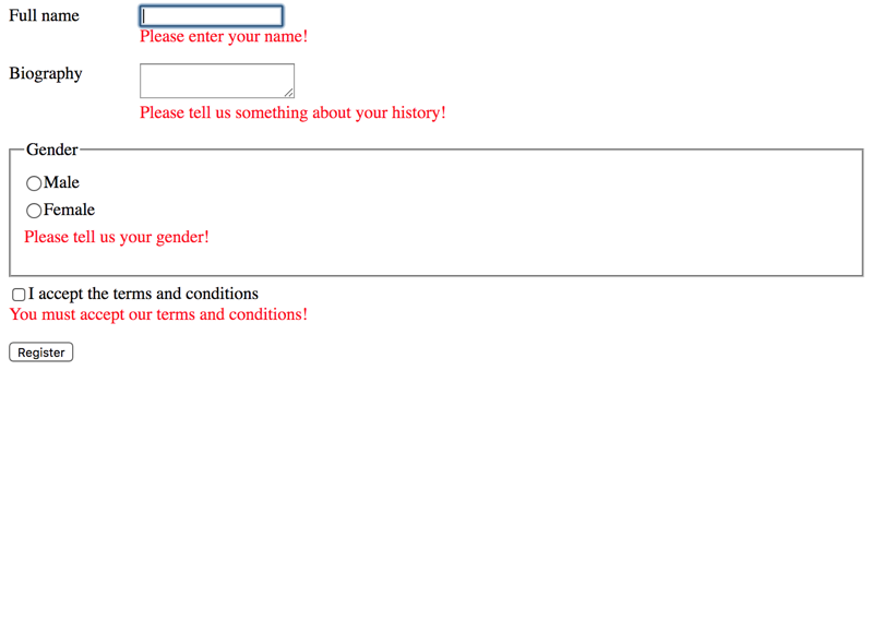
If there are any validation messages, the focus is set to the first invalid input: this way, a screen reader will immediately announce the associated message, so the user knows that there is at least one invalid input to be fixed.
After fixing the invalid input, the user can search for other invalid ones or simply submit the form again to repeat the process.
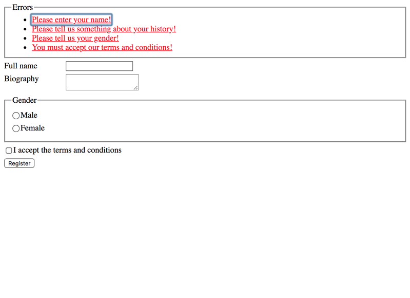
All messages on top
The following example is very similar to the one above, except in this use case, all messages are displayed inside a <fieldset>/<legend> structure on top of the form. Each message is an in-page link, targeting the respective invalid input.
In addition to this, each invalid input is associated to its message using aria-describedby. This is important, as it makes sure that screen readers also announce the messages when navigating through the inputs.
<form><divclass="control"><labelfor="name">Full name</label><inputid="name"name="name"type="text" /></div><divclass="control"><labelfor="biography">Biography</label><textareaid="biography"name="biography"type="text"></textarea></div><fieldset><legend>Gender</legend><divclass="control"><inputid="gender_female"name="gender"type="radio"value="female" /><labelfor="gender_female">Female</label></div><divclass="control"><inputid="gender_male"name="gender"type="radio"value="male" /><labelfor="gender_male">Male</label></div><divclass="control"><inputid="gender_nonbinary"name="gender"type="radio"value="nonbinary" /><labelfor="gender_nonbinary">Non-binary</label></div><divclass="control"><inputid="gender_unknown"name="gender"type="radio"value="unknown" /><labelfor="gender_unknown">I prefer not to say</label></div></fieldset><divclass="control"><inputid="accept_agbs"name="accept_agbs"type="checkbox"value="1" /><labelfor="accept_agbs">I accept the terms and conditions</label></div><divclass="control"><inputname="validate"type="hidden"value="1" /><inputtype="submit"value="Register" /></div></form>
;(function () {
var validateInput
$.urlParam = function (name) {
var results
results = newRegExp('[?&]' + name + '=([^&#]*)').exec(window.location.href)
if (results === null) {
returnnull
} else {
returndecodeURI(results[1]) || null
}
}
validateInput = function (input, message) {
var $elementToDescribe,
$error,
$errorContainer,
$fieldset,
$input,
$referencedElement,
value
$input = $('[name="' + input + '"]')
if ((value = $.urlParam(input)) === null) {
if ($('fieldset.errors').length === 0) {
$('body').prepend(
'<fieldset class="errors"><legend>Errors</legend><ul></ul></fieldset>'
)
}
$referencedElement = null
$elementToDescribe = null
$errorContainer = $('fieldset.errors ul')
if ($input.is(':radio')) {
$fieldset = $input.closest('fieldset')
$elementToDescribe = $fieldset
$referencedElement = $input.filter(':first')
} else {
$elementToDescribe = $input
$referencedElement = $input
}
$error = $(
'<a href="#' +
$referencedElement.attr('id') +
'" id="' +
input +
'_description" class="error">' +
message +
'</a>'
)
$error.click(e => {
// If we rely on the link's href pointing to the input's ID, it doesn't trigger forms mode in screen readers
$referencedElement.focus()
return e.preventDefault()
})
$elementToDescribe.attr('aria-describedby', input + '_description')
$errorContainer.append('<li>').find('li:last').append($error)
if ($(':not(body):focus').length === 0) {
// See https://stackoverflow.com/questions/46134247/jquery-setting-focus-doesnt-work-in-ie11/return $errorContainer.find('a').focus()
}
} else {
if ($input.is(':checkbox')) {
$input.attr('checked', true)
}
if ($input.is(':radio')) {
return $input.filter('[value="' + value + '"]').attr('checked', true)
} else {
return $input.val(value)
}
}
}
$(document).ready(function () {
if ($.urlParam('validate')) {
validateInput('name', 'Please tell us your full name!')
validateInput('biography', 'Please tell us something about yourself!')
validateInput('gender', 'Please tell us your gender!')
validateInput('accept_agbs', 'You must accept our terms and conditions!')
if ($('.error').length === 0) {
returnalert('All inputs are valid.')
}
}
})
}).call(this)
Category
Result
Comments
Date
Keyboard only
✔ (pass) pass
-
2018-5-14
NVDA 2018.1 + FF Quantum 59.0.2
✔ (pass) pass
-
2018-6-6
NVDA 2021.2 + Chrome
✔ (pass) pass
-
2021-2-10
NVDA 2023.1 + Edge
✔ (pass) pass
-
2023-7-13
JAWS 2018.3 + FF ESR 52.7.3
✔ (pass) pass
-
2018-6-6
JAWS 2021.2 + Chrome
✔ (pass) pass
-
2021-2-10
JAWS 2023.23 + Edge
⚠ (pass with comments) pass
the relation between the error message and the form field it not clear in Edge.
2023-7-13
If there are any validation messages, the focus is set to the first message: this way, a screen reader will immediately announce it, so the user knows that there is at least one invalid input to be fixed. As the message is also announced as "in-page link", the user can activate it and jump to the respective input; but the user also may decide to stay in the messages block and read the other messages before fixing any of the inputs.
After fixing the invalid input, the user can search for other invalid ones or simply submit the form again to repeat the process
Combining the two?
There exist hybrids of these two approaches.
Some people may find it useful to display the messages both on top and next to the form control: this has the advantage that visual users will always see the messages, even after scrolling down (which is not the case if the messages are only displayed on top).
Other people may only want to display a general message on top of the form, for example "There are 3 errors, please check your data and submit again". In this case, the focus should be set to this general message. This is one of the rare cases where adding a tabindex="0" to make a non-interactive element focusable is reasonable.
Further optimisations
Our examples above are very simple and created mainly to demonstrate screen reader usage. Please optimise your own form controls and validations for other users, too.
Visual enhancements
For example, add colours and other visual attributes to invalid fields, for example a thick coloured border, a decent background colour, etc.
Graphical icons can be a useful indicator, too, for example a fancy exclamation mark.
Meaningfulness of messages
It is also important to provide users with meaningful messages that help them fixing their input: while "Incorrect input format" is not very helpful for a date input, something like "Please enter in format YYYY/MM/DD" is much better.
Combining with HTML 5 client side validations?
You can easily combine (but not replace) these techniques with HTML 5 client side validations, see HTML 5 client side validations.