Indicating form controls as required using asterisks (*)
Asterisk (*) next to a form control's label usually indicates it as "required". Oftentimes, this asterisk's purpose is then explained somewhere else on the page. Many users (especially screen reader users) may be confused with that, so make sure this information is easily accessible.
Foot notes explaining asterisks
It is a common technique to add an asterisk * to a form control's label. Then, somewhere else on the page, for example below the form, this asterisk is explained to indicate a required input (in allusion to foot notes in text documents).
While visual users usually see both the asterisk and the explanation at a glance and can connect them with each other intuitively, screen reader users have to manually search for the asterisk's purpose. In addition to this, screen readers are often configured in such that they do not read all special characters, and thus ignoring asterisks completely.
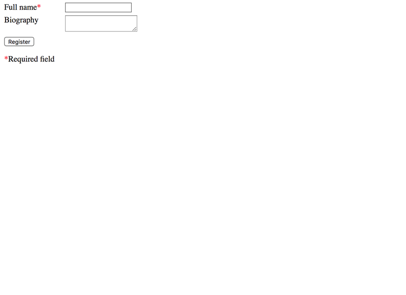
Bad example
In the following example, the required input field is announced as "Full Name Asterisk" in most screen readers. An experienced user will probably know what this is intended for, but many users will have no clue.
As the text explanation "required field" even is below the submit button of the form, a screen reader user probably will never read it, as activating the button usually is the last thing a user does when filling a form.
But aria-hidden does not seem to be respected in focus mode. What a bummer.
Better approach: using an icon
Instead of trying to work around the problem using ARIA, we can take an approach that works perfectly using plain old HTML.
Instead of trying to hide the plain text asterisk * in the label, we replace it with a decent icon. In our case, it is a fancy SVG graphic. Then we simply add the text "required" as a visually hidden element (for more info, see Hiding elements correctly).
To prevent Internet Explorer from making the SVGs focusable, the focusable="false" attribute is used. Instead of an SVG, you could also use a traditional image with empty alternative text (<img src="..." alt="" />).
Instead of a applying a visually hidden text "required", one can set a required attribute to the input: this makes screen readers announce an input as a required one.
The name of an invalid field is not automatically announced. This is nasty, but the user can find this information manually.
2018-6-6
NVDA 2021.2 + Chrome
✔ (pass) pass
-
2021-2-10
NVDA 2023.1 + Edge
✔ (pass) pass
-
2023-7-13
JAWS 2018.3 + FF ESR 52.7.3
⚠ (pass with comments) pass
The name of an invalid field is not automatically announced. This is nasty, but the user can find this information manually.
2018-5-7
JAWS 2021.2 + Chrome
✔ (pass) pass
-
2021-2-10
JAWS 2023.23 + Edge
✔ (pass) pass
-
2023-7-13
Technically this is much easier and cleaner (more information here: HTML 5 client side validations). But browser support is still rather shaky and the user experience with screen readers is shaky.
And often there may be cases where other texts than simply "required" are needed (and where there is no standard HTML attribute available), so it's good to have a more flexible solution: namely hidden texts.
You could also be interested in
Knowledge is power! Our guide has more to offer about:


