Datepicker widget
Datepickers are an easy and intuitive way to let users pick a date. They usually offer their options below their respective form control in a table-like design which can be toggled visible. Some date pickers also offer time settings.
General requirements
The following requirements are based on well established best practices; unlike most other common widget patterns, the WAI-ARIA Authoring Practices do not offer a section about datepickers.
Besides many other requirements, we want to stress out explicitly the following:
The meaning and usage of the datepicker must be clear.
Proper feedback must be given upon selecting a date.
The datepicker must be operable using both keyboard only and desktop screen readers (with a reasonable interplay of default keys like Tab, Enter/Space, Esc, Arrow keys), as well as mobile screen readers.
Proof of concept
Before you go on, please read What is a "Proof of concept"? .
According to our credo Widgets simply working for all , we advise to create datepickers as combination of a text input, and a group of radio buttons (acting as the options). They can be styled visually as needed using CSS, and spiced up with (very little) JavaScript, so they behave like perfect datepickers.
Sensible naming of elements (and a few specifically added visually hidden texts) guarantees that screen reader users know how to handle the element - even if they have not seen any other datepicker before.
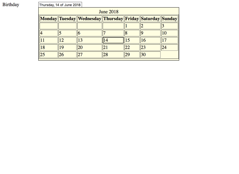
Datepicker with radio buttons
<button href ="#" id ="before" > Focusable element before</button >
<form >
<div data-adg-datepicker ="" >
<div class ="control" >
<label for ="birthday" > Birthday </label > <input aria-describedby ="birthday_help" id ="birthday" type ="text" />
<fieldset hidden ="" >
<legend > Available dates</legend >
</fieldset >
<div class ="description" id ="birthday_help" >
Provides datepicker upon clicking or arrow keys usage
</div >
</div >
</div >
</form >
<button href ="#" id ="after" > Focusable element after</button > @charset "UTF-8" ;
.adg-visually-hidden {
position : absolute;
white-space : nowrap;
width : 1px ;
height : 1px ;
overflow : hidden;
border : 0 ;
padding : 0 ;
clip : rect (0 0 0 0 );
clip-path : inset (50% );
margin : -1px ;
}
[data-adg-datepicker] {
position : relative;
}
[data-adg-datepicker-options] {
position : absolute;
float : left;
background-color : lightyellow;
border : 1px solid;
padding : 5px 0 ;
}
[data-adg-datepicker-option] {
display : block;
}
[data-adg-datepicker-option] :hover ,
[data-adg-datepicker-option-selected] {
cursor : pointer;
outline : 1px solid;
}
[data-adg-datepicker-alerts] p {
margin : 0 ;
}
[data-adg-datepicker-alerts] kbd ::before {
content : "«" ;
}
[data-adg-datepicker-alerts] kbd ::after {
content : "»" ;
}
.control {
margin : 6px 0 ;
}
input [type="text" ] {
width : 140px ;
}
label {
display : inline-block;
width : 120px ;
vertical-align : top;
}
.description {
margin-left : 120px ;
}
fieldset {
margin : -1px 0 0 120px ;
}
fieldset .control {
margin : 0 ;
}
fieldset label {
width : 100% ;
};(function (var AdgDatepicker
AdgDatepicker = function (var config
class AdgDatepicker {
constructor (el, options = {} ) {
this .$el = $(el)
this .config = config
this .currentDate = this .config ['date' ]
this .initInput ()
this .initOptions ()
this .applyCheckedOptionToInput ()
}
findOne (selector ) {
var result
result = this .$el .find (selector)
switch (result.length ) {
case 0 :
return this .throwMessageAndPrintObjectsToConsole (
`No object found for ${selector} !` ,
{
result : result
}
)
case 1 :
return $(result.first ())
default :
return this .throwMessageAndPrintObjectsToConsole (
`More than one object found for ${selector} !` ,
{
result : result
}
)
}
}
name (return 'adg-datepicker'
}
addAdgDataAttribute ($target, name, value = '' ) {
return $target.attr (this .adgDataAttributeName (name), value)
}
removeAdgDataAttribute ($target, name ) {
return $target.removeAttr (this .adgDataAttributeName (name))
}
adgDataAttributeName (name = null ) {
var result
result = `data-${this .name()} `
if (name) {
result += `-${name} `
}
return result
}
labelOfInput ($inputs ) {
return $inputs.map ((i, input ) => {
var $input, $label, id
$input = $(input)
id = $input.attr ('id' )
$label = this .findOne (`label[for='${id} ']` )[0 ]
if ($label.length === 0 ) {
$label = $input.closest ('label' )
if ($label.length === 0 ) {
this .throwMessageAndPrintObjectsToConsole (
'No corresponding input found for input!' ,
{
input : $input
}
)
}
}
return $label
})
}
show ($el ) {
$el.removeAttr ('hidden' )
return $el.show ()
}
hide ($el ) {
$el.attr ('hidden' , '' )
return $el.hide ()
}
throwMessageAndPrintObjectsToConsole (message, elements = {} ) {
console .log (elements)
throw message
}
text (text, options = {} ) {
var key, value
text = this .config [`${text} Text` ]
for (key in options) {
value = options[key]
text = text.replace (`[${key} ]` , value)
}
return text
}
initInput (this .$input = this .findOne ('input[type="text"]' )
this .$input .attr ('autocomplete' , 'off' )
this .$input .attr ('aria-expanded' , 'false' )
return this .attachInputEvents ()
}
initOptions (this .$optionsContainer = this .findOne ('fieldset' )
this .addAdgDataAttribute (this .$optionsContainer , 'options' )
this .$optionsContainerLabel = this .findOne ('legend' )
this .$optionsContainerLabel .addClass ('adg-visually-hidden' )
this .initDate ()
return this .setSelection (this .currentDate .getDate () - 1 , false )
}
getFirstMonthDay (date ) {
var m, y
y = date.getFullYear ()
m = date.getMonth ()
return new Date (y, m, 1 )
}
getLastMonthDay (date ) {
var m, y
y = date.getFullYear ()
m = date.getMonth ()
return new Date (y, m + 1 , 0 )
}
initDate (var $dateTable,
$tr,
day,
daysOfMonth,
firstDay,
i,
id,
j,
k,
lastDay,
len,
len1,
ref,
value,
weekday
this .$optionsContainer .find ('table' ).remove ()
$dateTable = $(
`<table border='1'><caption>${
this .config['monthNames' ][this .currentDate.getMonth()]
} ${this .currentDate.getFullYear()} </caption><thead></thead></table>`
)
ref = this .config ['dayNames' ]
for (j = 0 , len = ref.length ; j < len; j++) {
weekday = ref[j]
$dateTable.find ('thead' ).append (`<th>${weekday} </th>` )
}
this .$optionsContainer .append ($dateTable)
firstDay = this .getFirstMonthDay (this .currentDate )
lastDay = this .getLastMonthDay (this .currentDate )
daysOfMonth = []
day = firstDay
while (day <= lastDay) {
daysOfMonth.push (new Date (day))
day.setDate (day.getDate () + 1 )
}
i = 1
firstDay = daysOfMonth[0 ].getDay ()
while (i < firstDay) {
daysOfMonth.unshift (null )
i++
}
i = daysOfMonth[daysOfMonth.length - 1 ].getDay ()
while (i > 0 && i < 6 ) {
daysOfMonth.push (null )
i++
}
$tr = null
for (i = k = 0 , len1 = daysOfMonth.length ; k < len1; i = ++k) {
day = daysOfMonth[i]
if (i % 7 === 0 ) {
$tr = $('<tr></tr>' )
$dateTable.append ($tr)
}
value = day
? ((id = `favorite_hobby_${i} ` ),
`<input type='radio' name='hobby' id='${id} ' /><label for='${id} '><span class='adg-visually-hidden'>${this .getDayName(
day.getDay()
)} , </span>${day.getDate()} <span class='adg-visually-hidden'> of ${
this .config['monthNames' ][day.getMonth()]
} ${day.getFullYear()} </span></label>` )
: ''
$tr.append (`<td class='control'>${value} </td>` )
}
this .$options = this .$optionsContainer .find ('input[type="radio"]' )
this .attachOptionsEvents ()
this .addAdgDataAttribute (this .labelOfInput (this .$options ), 'option' )
return this .$options .addClass ('adg-visually-hidden' )
}
getDayName (day ) {
if (day === 0 ) {
day = 6
}
return this .config ['dayNames' ][day - 1 ]
}
attachInputEvents (this .attachClickEventToInput ()
this .attachEscapeKeyToInput ()
this .attachEnterKeyToInput ()
this .attachTabKeyToInput ()
return this .attachUpDownKeysToInput ()
}
attachOptionsEvents (this .attachArrowKeysToOptions ()
this .attachChangeEventToOptions ()
this .attachClickEventToOptionLabels ()
this .attachEnterEventToOptions ()
return this .attachTabEventToOptions ()
}
attachClickEventToInput (return this .$input .click (() => {
if (this .$optionsContainer .is (':visible' )) {
return this .hideOptions ()
} else {
return this .showOptions ()
}
})
}
attachEscapeKeyToInput (return this .$input .keydown (e =>if (e.which === 27 ) {
if (this .$optionsContainer .is (':visible' )) {
this .applyCheckedOptionToInputAndResetOptions ()
return e.preventDefault ()
} else if (this .$options .is (':checked' )) {
this .$options .prop ('checked' , false )
this .applyCheckedOptionToInputAndResetOptions ()
return e.preventDefault ()
} else {
return $('body' ).append ('<p>Esc passed on.</p>' )
}
}
})
}
attachEnterKeyToInput (return this .$input .keydown (e =>if (e.which === 13 ) {
if (this .$optionsContainer .is (':visible' )) {
this .applyCheckedOptionToInputAndResetOptions ()
return e.preventDefault ()
} else {
return $('body' ).append ('<p>Enter passed on.</p>' )
}
}
})
}
attachTabKeyToInput (return this .$input .keydown (e =>if (e.which === 9 ) {
if (this .$optionsContainer .is (':visible' )) {
return this .applyCheckedOptionToInputAndResetOptions ()
}
}
})
}
attachUpDownKeysToInput (return this .$input .keydown (e =>if (e.which === 38 || e.which === 40 ) {
this .showOptions ()
return e.preventDefault ()
}
})
}
showOptions (this .show (this .$optionsContainer )
this .$input .attr ('aria-expanded' , 'true' )
if (this .$options .filter (':checked' ).length === 0 ) {
this .currentDate = this .config ['date' ]
this .initDate ()
this .setSelection (this .currentDate .getDate () - 1 )
}
return this .$options .filter (':checked' ).focus ()
}
hideOptions (this .hide (this .$optionsContainer )
this .$input .attr ('aria-expanded' , 'false' )
return this .$input .focus ()
}
moveSelection (direction ) {
var currentIndex, maxIndex, upcomingIndex
maxIndex = this .$options .length - 1
currentIndex = this .$options .index (
this .$options .parent ().find (':checked' )
)
upcomingIndex =
direction === 'left'
? currentIndex <= 0
? ((this .currentDate = this .previousMonth (this .currentDate )),
this .initDate (),
-1 )
: currentIndex - 1
: direction === 'up'
? currentIndex - 7 < 0
? ((this .currentDate = this .previousMonth (this .currentDate )),
this .initDate (),
-1 )
: currentIndex - 7
: direction === 'right'
? currentIndex === maxIndex
? ((this .currentDate = this .nextMonth (this .currentDate )),
this .initDate (),
0 )
: currentIndex + 1
: direction === 'down'
? currentIndex + 7 > maxIndex
? ((this .currentDate = this .nextMonth (this .currentDate )),
this .initDate (),
0 )
: currentIndex + 7
: void 0
return this .setSelection (upcomingIndex)
}
setSelection (current, change = true ) {
var $currentOption
if (current === -1 ) {
current = this .$options .length - 1
}
$currentOption = $(this .$options [current])
$currentOption.prop ('checked' , true )
if (change) {
$currentOption.trigger ('change' )
return $currentOption.focus ()
}
}
previousMonth (now ) {
if (now.getMonth () === 0 ) {
return new Date (now.getFullYear () - 1 , 11 , 1 )
} else {
return new Date (now.getFullYear (), now.getMonth () - 1 , 1 )
}
}
nextMonth (now ) {
if (now.getMonth () === 11 ) {
return new Date (now.getFullYear () + 1 , 11 , 1 )
} else {
return new Date (now.getFullYear (), now.getMonth () + 1 , 1 )
}
}
attachArrowKeysToOptions (return this .$options .keydown (e =>if (
e.which === 37 ||
e.which === 38 ||
e.which === 39 ||
e.which === 40
) {
if (e.which === 37 ) {
this .moveSelection ('left' )
} else if (e.which === 38 ) {
this .moveSelection ('up' )
} else if (e.which === 39 ) {
this .moveSelection ('right' )
} else if (e.which === 40 ) {
this .moveSelection ('down' )
}
return e.preventDefault ()
}
})
}
attachChangeEventToOptions (return this .$options .change (e =>return this .applyCheckedOptionToInput ()
})
}
applyCheckedOptionToInputAndResetOptions (this .applyCheckedOptionToInput ()
return this .hideOptions ()
}
applyCheckedOptionToInput (var $checkedOption, $checkedOptionLabel, $previouslyCheckedOptionLabel
$previouslyCheckedOptionLabel = $(
`[${this .adgDataAttributeName('option-selected' )} ]`
)
if ($previouslyCheckedOptionLabel.length === 1 ) {
this .removeAdgDataAttribute (
$previouslyCheckedOptionLabel,
'option-selected'
)
}
$checkedOption = this .$options .filter (':checked' )
if ($checkedOption.length === 1 ) {
$checkedOptionLabel = this .labelOfInput ($checkedOption)
this .$input .val ($.trim ($checkedOptionLabel.text ()))
return this .addAdgDataAttribute (
$checkedOptionLabel,
'option-selected'
)
} else {
return this .$input .val ('' )
}
}
attachClickEventToOptionLabels (return this .labelOfInput (this .$options ).click (e =>return this .hideOptions ()
})
}
attachEnterEventToOptions (return this .$options .keydown (e =>if (e.which === 13 ) {
this .hideOptions ()
e.preventDefault ()
return e.stopPropagation ()
}
})
}
attachTabEventToOptions (return this .$options .keydown (e =>if (e.which === 9 ) {
return this .hideOptions ()
}
})
}
}
config = {
date : new Date (),
dayNames : [
'Monday' ,
'Tuesday' ,
'Wednesday' ,
'Thursday' ,
'Friday' ,
'Saturday' ,
'Sunday'
],
monthNames : [
'January' ,
'February' ,
'March' ,
'April' ,
'May' ,
'June' ,
'July' ,
'August' ,
'September' ,
'October' ,
'November' ,
'December'
]
}
return AdgDatepicker
}.call (this )
$(document ).ready (function (return $('[data-adg-datepicker]' ).each (function (return new AdgDatepicker (this )
})
})
}).call (this )
Category
Result
Date
Keyboard only
✔ (pass) pass
-
2018-6-11
NVDA 2023.1 + FF 115
✔ (pass) pass
-
2023-8-3
NVDA 2021.2 + Chrome
✔ (pass) pass
-
2021-2-10
NVDA 2023.1 + Edge
✔ (pass) pass
-
2023-7-13
JAWS 2018.3 + FF ESR 52.7.3
✔ (pass) pass
-
2018-6-11
JAWS 2021.2 + Chrome
✔ (pass) pass
-
2021-2-10
JAWS 2023.1 + Edge
✔ (pass) pass
-
2023-7-13
Implementation details
Some interesting peculiarities:
The filter input has:
A descriptive text attached to it using aria-describedby (see Adding descriptions to elements using aria-describedby ), giving a clue that the element provides a datepicker upon click and arrow key usage.
An aria-expanded attribute (see Marking elements expandable using aria-expanded ), giving a clue that there is something to be expanded (the datepicker).
An autocomplete="off" attribute so it does not trigger the browser's autocomplete feature (which remembers previous user input and offers it again).
The datepicker appears upon clicking into the input, pressing Up/Down or Arrow keys.
As soon as the datepicker appears, its group of radio buttons gains focus: from now on, the user interacts only with the radio buttons.
Using Left/Right keys, the date changes by one day, and using Up/Down keys, the date changes by one week.
The default toggling behaviour of radio buttons is overridden using JavaScript.
The radio buttons are inside a <fieldset>/<legend> structure, giving context to them (see Grouping form controls with fieldset and legend ).
The radio buttons are laid out inside a <table>, see Forms within tables .
This does not only serve visual purposes, but also allows screen reader users to manually browse the table.
Adding more sophisticated features like controls for choosing a day, month, or year directly, or enhancing the datepicker with time options, would be easy. For simplicity though, we refrained from doing this.
Further discussions
Some datepickers allow manual input, others do not. The difficult thing with allowing manual input is parsing the input given: one user may provide an input like 2018/11/19, another one may provide 19.11.2018.
If you allow manual input of a date, you need to provide its required format, for example right inside the input's label, like Birthday (YYYY/MM/DD), or in a descriptive text next to the input (see Placing non-interactive content between form controls ).
Besides simply allowing manual input of a full date, your datepicker can offer nice features depending on the user's input. For example, if the user inputs 2016, the datepicker could offer the days of the current month of the year 2016; or if the user inputs 2016/10, the datepicker could offer the days of October 2016. This way the user can narrow the desired date quickly and then can use the datepicker to choose a day.
In our implementation, the datepicker is attached directly to the text input, and usage of the Arrow keys triggers date selection. This means that the Arrow keys are not available for text editing anymore, which can be confusing.
To prevent this, you could attach the datepicker to a dedicated button next to the text input instead, similar to a complex tooltip, see Tooltip widgets (or: screen tip, balloon) , or even to a dialog, see Dialog widget (or: modal, popup, lightbox, alert) . Be sure to give this button a proper name, like Birthday datepicker.
In HTML 5 exist date and time specific inputs, like <input type="date"> or <input type="time">.
While some browsers provide nice datepickers themselves for such inputs, this is not yet supported by some major browsers. So from an accessibility point of view: if you do not want to force some of your users to input dates manually, you are better off using an custom datepicker instead of these HTML 5 features (yet).